
Landing Page Structure: Templates for Different Goals and Visitors
August 19, 2026
Author: Shusaku Yosa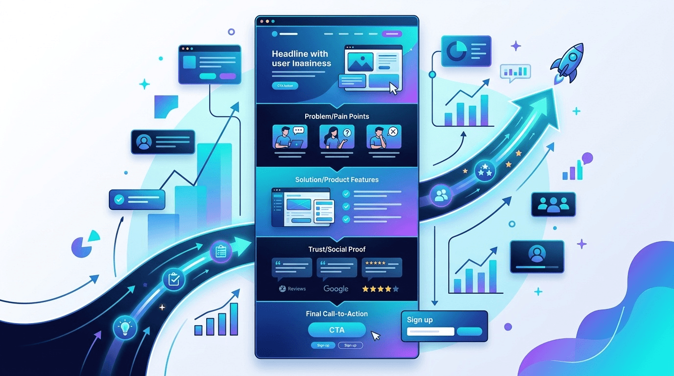
A landing page structure should help a visitor find the information needed for a decision and understand the next available action. A long problem-and-solution page is one option; a concise page that leads with price and specifications is another. Use the following templates and completed brief to choose sections for a download, consultation or purchase.
Define the visitor, offer and next action
Begin with a sentence describing the visitor, the message that brought them to the page and the task they want to complete. Someone comparing specifications may already understand the problem. Someone encountering a resource for the first time may need to see what it contains before considering a form.
Separate known information from unanswered questions. Do not assume every visitor follows the same emotional sequence or that every advertising visitor is ready to buy. GOV.UK’s guidance on user needs starts with real tasks and difficulties rather than demographic labels alone. Record the audience, the actual offer and one primary next action in the brief.
Map sections to questions and evidence
The opening establishes relevance, the body provides decision material, and action points explain what happens next. These are useful roles, not a mandatory number of blocks. Translate features into a practical use, then support that explanation with a sample and its limitations.
Section candidate | Visitor question | Evidence to prepare |
|---|---|---|
Heading and overview | Is this relevant to me? | Audience, offer and key conditions |
Specifications or demonstration | Does it fit my task? | Current details, real samples and exclusions |
Case study or testimonial | Under what conditions was it used? | Permission, dates, scope and undisclosed results |
Conditions or FAQ | What should I know before acting? | Actual costs, access, cancellation or delivery terms |
Call to action | What happens if I select this? | Destination, required information and next steps |
Google Ads’ landing page guidance concerns relevance, usefulness and ease of navigation. It does not prescribe a universal section order. Once the content is chosen, use the landing page design checks to consider its visual presentation.
Choose a download, consultation or purchase template
These layouts are illustrative starting points. Choose according to the visitor’s task, not a rule that all business pages must be long or all consumer pages must be short.
Goal and starting point | Possible sequence | What to verify |
|---|---|---|
Download: contents are unfamiliar | Audience and contents → access conditions → form → FAQ | Actual resource, delivery method and follow-up contact |
Consultation: the problem is known | Scope → process and conditions → responsible team → request → FAQ | Exclusions, charges and response method |
Purchase: alternatives are being compared | Product and price → specifications → delivery and returns → purchase | Current terms, specifications and relevant availability |
Place answers near the decision they affect. A delivery question may belong beside the purchase conditions, and an explanation of data use belongs near a form. A visitor who already knows the problem does not need a long section persuading them that the problem exists.
Complete a fictional outline and CTA brief
The following is a fictional teaching example for an advertising-cost worksheet aimed at a small ecommerce team. It is not an actual NeX-Ray resource, offer or service condition.
Section | Completed brief | Acceptance check |
|---|---|---|
Opening | An advertising-cost worksheet for small ecommerce teams | Description matches the actual file |
Body | Show fields, instructions and costs the sheet cannot compare | Check rights, sample inputs and calculation assumptions |
CTA | “Get the cost worksheet” | Confirm whether delivery is by email or immediate access |
FAQ | Cost, permitted use and follow-up contact | Match the real access conditions |
The number of action points depends on page length and the task. Repeated buttons for the same action should use consistent wording and destinations. W3C’s explanation of link purpose supports labels whose purpose is understandable from the text or context; it does not establish a guaranteed click-rate advantage.
Check claims, conditions and navigation
Treat badges and testimonials as claims requiring evidence. A number-one claim needs its scope, method and date. A satisfaction percentage needs a defined question and respondent base. If evidence or permission is missing, explain the product using verified specifications and examples instead.
- Check that “free,” limited availability and refunds reflect the actual terms.
- State included costs and exclusions where a visitor needs them.
- Follow the action through the form and completion message.
- Keep important conditions available as readable text.
On phones, also test keyboard and banner overlap. The mobile landing page testing guide covers those operational checks.
Evaluate the structure hypothesis after release
Record the reason for a structural change and the outcome definition before release. CTA clicks, sessions starting a form, verified successful sessions and qualified inquiries are different measurements. More clicks do not establish more registrations or revenue.
- Define the visitor’s unanswered question and the proposed change.
- Align the URL, language, channel, device conditions and comparison period.
- If controlled A/B delivery is available, specify allocation, the primary measure and stopping conditions.
- Separate usability failures from outcome changes and avoid causal conclusions from a small before-and-after sample.
Google Ads custom experiments apply to supported advertising experiments; they do not imply that every CMS can split landing page traffic. When a controlled test is unavailable, observe whether readers can find conditions and complete the intended task, then retain the findings in the brief.